Code Notes
<– back to Restaurant Review Code Notes homepage
These notes chronicle the following:
- Creating a build process for these notes (Prep)
- Normalizing the layout
- Making the Restaurant Review App fully responsive
- Making the Restaurant Review App fully accessible
- Implementing offline caching using a Service Worker and the Cache API
- Project submission
1. Prep
1.1 Local Setup
In preparation to complete stage one of this project, I had to do the following:
- Fork and clone the mws-restaurant-stage-1 starter repository.
- Get my own Google Maps API key.
- Get an http server going on localhost. I used http-server, a node-based command-line http-server.
1.2 Set up Jekyll
This is done so I could turn my markdown notes into a statically generated website. This Jekyll setup is the same one used by GitHub Pages to generate the site on their servers once I push my Markdown notes and enable the feature on the repository.
I followed these steps to get a version of the Jekyll build system running locally.
- Create a ‘docs/’ folder off my repo root.
- Add a ‘README.md’ to the ‘docs/’ folder.
git commit...&git pushto update the repo on GitHub.- On GitHub, go to your repo’s Settings -> GitHubPages -> Theme Chooser. I chose the “Leap Day” theme.
- On GitHub, under Settings -> GitHubPages -> Source, choose ‘master branch /docs folder’ & hit Save.
- This adds a new commit on GitHub so you need to do a
git pullto get the latest changes locally. - Copy any customized files from the jekyll template (Leap Year theme in this case) into this repo. I have quite a few customized files, so this includes the following folders that are copied into ‘docs/’:
- ‘_layouts/’
- ‘assets/css/’
- ‘assets/images/’
- ‘assets/js/’
1.3 Set up Grunt
This is done so that I can automate the process of compressing screen captured images for these notes. I followed the instructions in this post
to create a Gruntfile.js to work with my setup.
Here’s what I did
- Create a ‘docs/src/images/’ folder to contain all original JPGs.
- Created a packages.json under ‘docs/’. Steps to do so are in Grunt Getting Started.
- Created my Gruntfile.js.
- Run
npm install. - Run
grunt.
package.json
{
  "name": "mws-restaurant-stage-1-grunt",
  "version": "0.1.0",
  "description": "grunt task for creating multi-sized responsive images",
  "main": "main.js",
  "scripts": {
    "test": "echo \"Error: no test specified\" && exit 1"
  ,
  "repository": {
    "type": "git",
    "url": "https://github.com/james-priest/mws-restaurant-stage-1.git"
  },
  "author": "James Priest",
  "license": "ISC",
  "devDependencies": {
    "grunt": "^1.0.2",
    "grunt-contrib-clean": "^1.1.0",
    "grunt-contrib-watch": "^1.1.0",
    "grunt-responsive-images": "^1.10.1"
  }
}
Gruntfile.js
responsive_images: {
  dev: {
    options: {
      sizes: [
        {
          width: 800,
          quality: 85,
          rename: false
        },
        {
          name: 'small',
          width: 570,
          quality: 85
        }
      ]
    },
    files: [{
      expand: true,
      cwd: 'src/images/',
      src: ['*.{jpg,png}'],
      dest: 'assets/images/'
    }]
  }
},
watch: {
  dev: {
    files: ['src/images/*.{jpg,png}'],
    tasks: ['responsive_images']
  }
}
2. Normalize Layout
2.1 Starting the http-server
I then fired up the server to look at the site in its current state.
http-server . -p 8000
2.2 View original site
Here are some screen grabs of the site was it looked “out-of-the-box”.
BEFORE
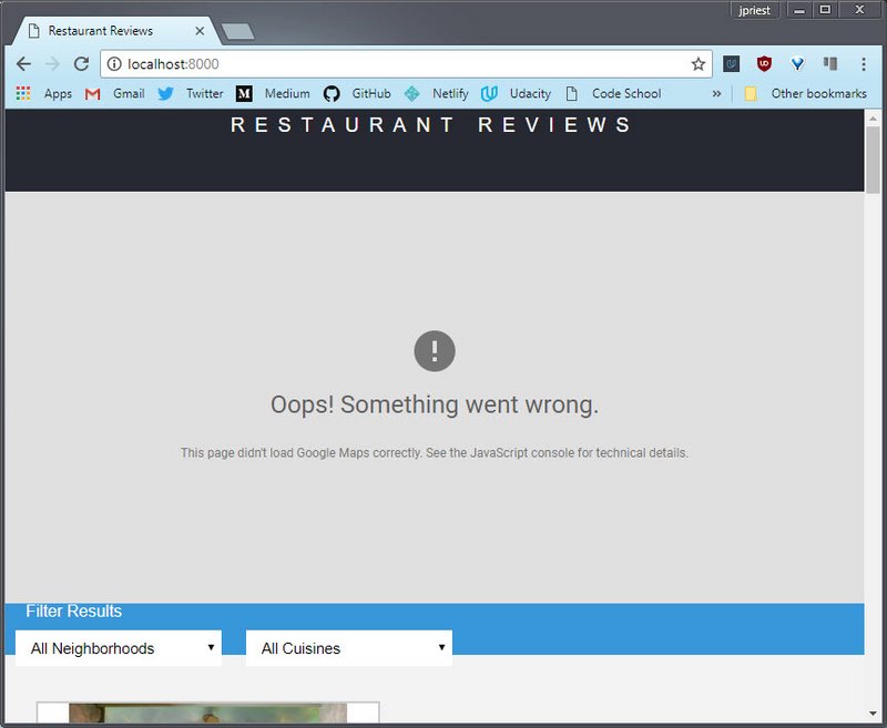 Figure 1: Homepage map
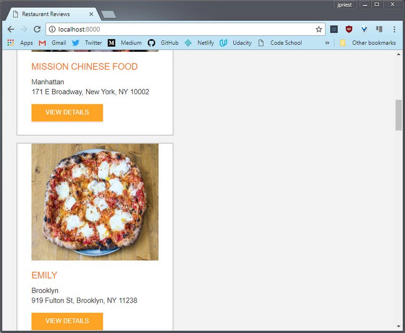 Figure 2: Homepage restaurants
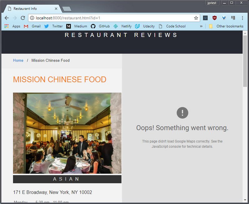 Figure 3: Detail restaurant page: map & image
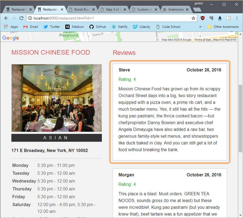
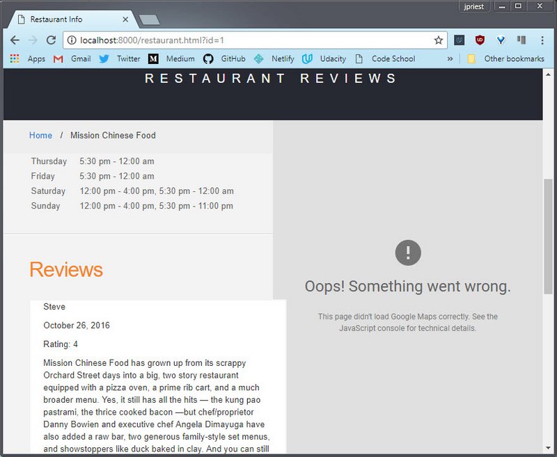 Figure 4: Detail restaurant page: reviews
2.3 First set of changes
Here are the steps I applies
- Added UTF meta tag to both index.html & restaurant.html
<meta charset="UTF-8"> - Added viewport meta tag to both index.html & restaurant.html
<meta name="viewport" content="width=device-width, initial-scale=1.0"> - Increased default
font-sizeto16pxfor small displays/* font-family: Arial, Helvetica, sans-serif; */ /* font-size: 10pt; */ /* line-height: 1.5; */ body,td,th,p { font: 16px/1.6 Arial, Helvetica, sans-serif; } - Commented out all unnecessary css style rules in ‘styles.css’. This included
- Hardcoded
widthsettings on various elements - Hardcoded
font-sizesettings on various elements - Unnecessary
marginorpadding - Unnecessary
position: fixedandposition: absolute
- Hardcoded
- Added
display: gridanddisplay: flexboxfor content centering- Header nav
- Restaurant list
- Went back and set
width: 100%so elements would fill available space.
2.4 View new flow layout
AFTER HTML & CSS UPDATES
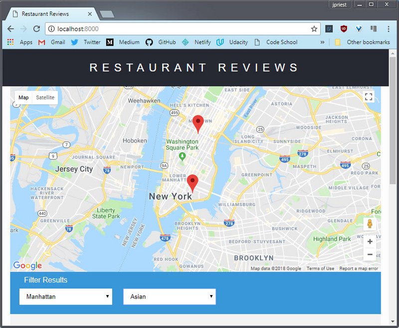 Figure 5: Homepage map with flow layout
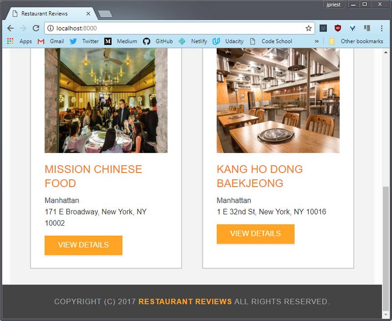 Figure 6: Homepage restaurants with flow layout
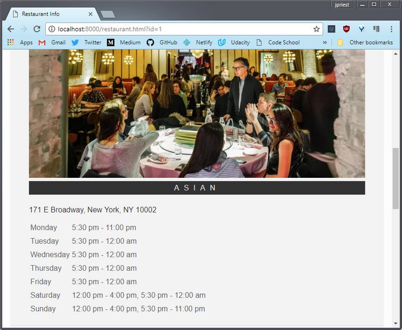 Figure 7: Detail restaurant page: map & image with flow layout
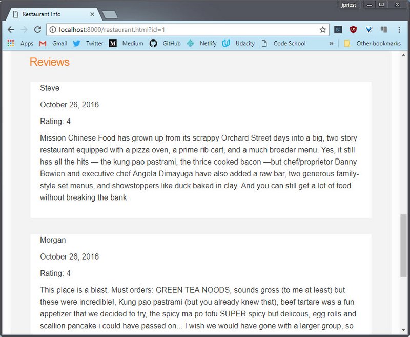 Figure 8: Detail restaurant page: reviews with flow layout
3. Responsive Design
3.1 Open DevTools
Starting small, I created various breakpoints according to where the layout naturally needed it. Here are the steps I followed:
Opened up DevTools and made the viewport somewhat small to see how it would affect the site.
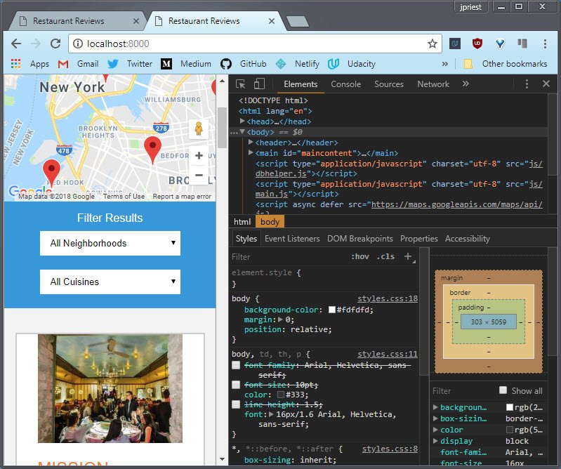 Figure 9: Homepage: DevTools open to smallest viewport
3.2 Toggle Device Toolbar
Then I toggled on the device toolbar. From here I could set various viewport widths.
I was also able to see my media queries and adjust various style settings from DevTools as I stretch and shrunk the viewport.
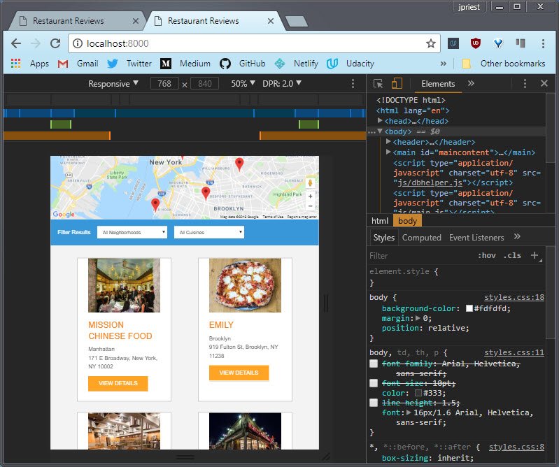 Figure 10: Homepage: DevTools with device toolbar
3.2 Determine Breakpoints
I started small and worked my way up, making sure each breakpoint transitioned smoothly to the next.
Each successful change in DevTools was reflected in the stylesheet I had open in my code editor.
When I was done I ended up with a site that looked great across viewport sizes.
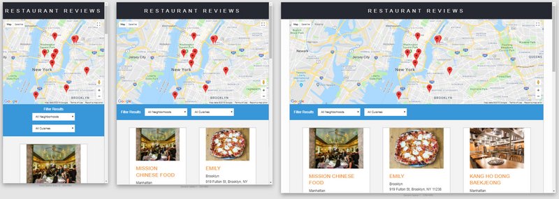 Figure 11: Homepage across multiple device display sizes
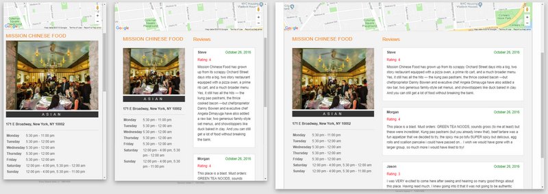 Figure 12: Detail page across multiple device display sizes
4. Responsive Images
4.1 Determine image sizes
The first step was to go through my now wonderfully responsive site and determine the various sizes I need to target for each image at various viewport sizes.
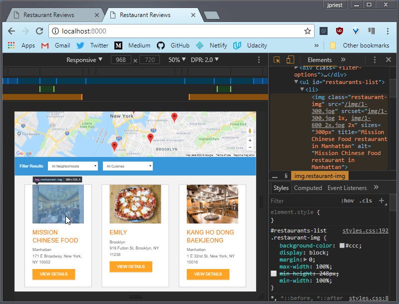 Figure 13: Homepage with image selected
I settled on the following.
- 300px
- 400px
- 600px (2x device pixel density)
- 800px (2x dpp)
Currently all images are sized at 800x600 pixels.
4.2 Setup Grunt
Next I had to set Grunt up to do the responsive image compression.
Here’s the important part of the Gruntfile.js config I created.
      responsive_images: {
        dev: {
          options: {
            engine: 'gm',
            sizes: [
              {
                width: 300,
                quality: 60
              },
              {
                width: 400,
                quality: 60
              },
              {
                width: 600,
                quality: 60,
                suffix: '_2x'
              },
              {
                width: 800,
                quality: 60,
                suffix: '_2x'
              }
            ]
          },
          files: [{
            expand: true,
            cwd: 'img_src/',
            src: ['*.{gif,jpg,png}'],
            dest: 'img/'
          }]
        }
      }
Given ‘1.jpg’, this creates the following set of compressions for each image:
- 1-300.jpg
- 1-400.jpg
- 1-600_2x.jpg
- 1-800_2x.jpg
4.3 Update the data
The next step was to update the data. In this case, the restaurants.json file. It contains all the relevant restaurant data. I added in srcset info for each restaurant image.
 "restaurants": [{
    "id": 1,
    "name": "Mission Chinese Food",
    "neighborhood": "Manhattan",
    "photograph": "1-300.jpg",
    "srcset_index": "img/1-300.jpg 1x, img/1-600_2x.jpg 2x",
    "srcset_restaurant": "img/1-300.jpg 300w, img/1-400.jpg 400w,
                          img/1-600_2x.jpg 600w, img/1-800_2x.jpg 800w",
    "address": "171 E Broadway, New York, NY 10002",
    "latlng": {
      "lat": 40.713829,
      "lng": -73.989667
    },
Here I chose to use Pixel Density Descriptor (1x, 2x, 3x) syntax for the index page’s srcset and image size for the restaurant detail page srcset.
4.4 Update the code
The next step was to update the code so that it pulled the data from the database (json) and used it to properly update the html output.
DB Helper.js has helper methods to format the data. Currently we are not formatting the return data but it’s wrapped in template literals in order to allow this in the future.
dbhelper.js
 /**
   * Index image Srcset.
   */
  static imageSrcsetForIndex(restaurant) {
    return (`${restaurant.srcset_index}`);
  }

  /**
   * Restaurant image Srcset.
   */
  static imageSrcsetForRestaurant(restaurant) {
    return (`${restaurant.srcset_restaurant}`);
  }
restaurant_info.js
// detail page
fillRestaurantHTML = (restaurant = self.restaurant) => {
  const name = document.getElementById('restaurant-name');
  name.innerHTML = restaurant.name;

  const address = document.getElementById('restaurant-address');
  address.innerHTML = restaurant.address;

  const image = document.getElementById('restaurant-img');
  image.className = 'restaurant-img'
  image.src = DBHelper.imageUrlForRestaurant(restaurant);
  image.srcset = DBHelper.imageSrcsetForRestaurant(restaurant);
  image.sizes = "(max-width: 320px) 300px, (max-width: 425px) 400px,
                 (max-width: 635px) 600px, (min-width: 636px) 400px";
  ...
}
main.js
// index page
createRestaurantHTML = (restaurant) => {
  const li = document.createElement('li');

  const image = document.createElement('img');
  image.className = 'restaurant-img';
  image.src = DBHelper.imageUrlForRestaurant(restaurant);
  image.srcset = DBHelper.imageSrcsetForIndex(restaurant);
  image.sizes = "300px";
Here I could have pulled the sizes data from the json file but since this data won’t be changing from image to image, I decided to just hard code it here.
The final result is shown here.
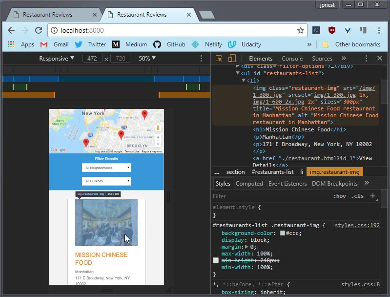 Figure 14: Homepage with image srcset & sizes attributes
5. Accessibility
5.1 DevTools Audit
I opened up DevTools and navigated to the Audits tab.
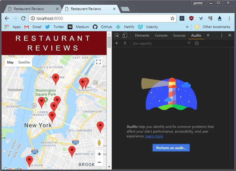 Figure 15: DevTools Audits tab
From there you can choose to run an audit on any or all of the following:
- Performance
- Progressive Web App
- Best Practices
- Accessibility
- SEO
For this I deselected everything except accessibility.
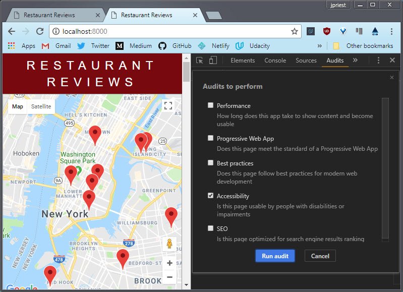 Figure 16: DevTools Audits selection screen
This returned a series of recommendations including
- use of better contrast between colors
- proper alt & title tags for images
- title for iframe
5.2 Better contrast
This was very straight forward. The audit specified which elements to target. In my case, the things I needed to update were
- contrast between link colors
- contrast between footer and footer text
The following style rules were updated.
a {
  /* color: orange; */
  /* color: #d85b5b; */
  color: #ff9292;
  text-decoration: none;
}
a:hover, a:focus {
  /* color: #3397db; */
  color: #d85b5b;
  text-decoration: none;
}
#footer {
  background-color: #444;
  /* color: #aaa; */
  color: #ccc;
}
5.3 Better affordance
Some of the other style changes I made were cosmetic but these helped to create a better looking layout which added to the overall affordance and usability.
This includes:
- Updating the color scheme for buttons, links, and nav to use a dark burgundy.
- Changing Link buttons to actual
<button>controls - Updating links to use a subtle dotted underline for better affordance
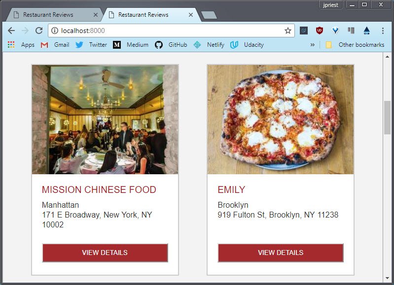 Figure 17: New look for buttons
The changes to the links consisted of the following:
#breadcrumb li a {
  /* color: #0275d8; */
  color: #d85b5b;
  text-decoration: none;
  border-bottom: 1px dotted #d85b5b;
}
/* Add a color on mouse-over */
#breadcrumb li a:hover {
  /* color: #01447e; */
  color: #333;
  text-decoration: underline;
  border: none;
}
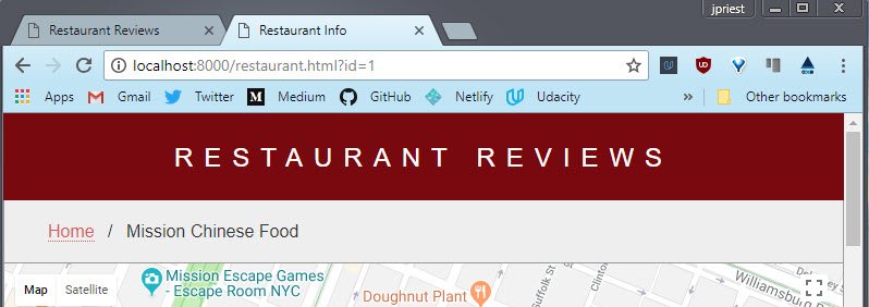 Figure 18: Updated link treatment
5.4 Better usability
The changes that were about usability consisted of updating the cursor to a pointer when it hovered over a button and also setting a hover color.
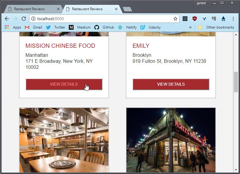 Figure 19: Updated button treatment
The css changes were:
#restaurants-list li button {
  /* background-color: orange; */
  background-color: brown;
  color: #fff;
  padding: 10px 30px;
  text-align: center;
  text-transform: uppercase;
  margin: 0 20px;
}
#restaurants-list li button:hover {
  color: #ff9292;
  cursor: pointer;
}
5.5 Updated look and feel
The site now has a new look and feel across multiple viewports and devices.
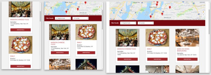 Figure 20: New homepage treatment
Here’s the details page
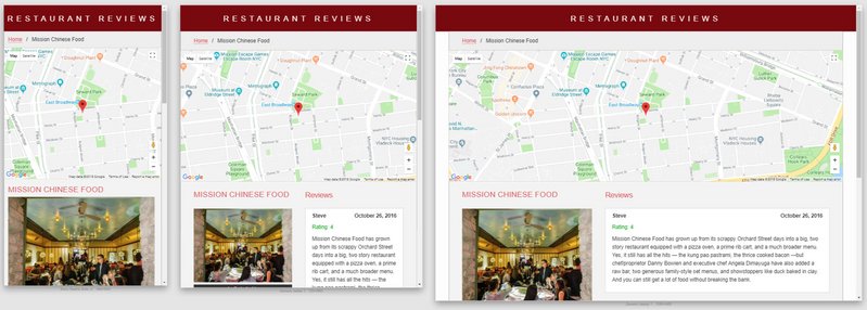 Figure 21: New restaurant page treatment
6. SW with Cache API
6.1 Register SW code
The first step was to register the Service Worker. I did this by creating ‘register_sw.js’ with the following code.
if (navigator.serviceWorker) {
  navigator.serviceWorker.register('sw.js')
  .then(registration => {
    console.log(`Registration successful, scope is ${registration.scope}`);
  }).catch(error => {
    console.log(`Service worker registration failed, error: ${error}`);
  });
}
Then the script must be included on every page. In this case, ‘index.html’ and ‘restaurant.html’
  <script src="js/dbhelper.js"></script>
  <script src="js/register_sw.js"></script> <!-- new -->
  <script src="js/main.js"></script>
this is the result when I open the page in the browser with DevTools open.
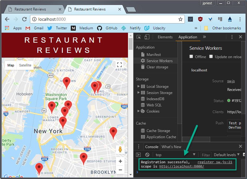 Figure 22: Chrome DevTools showing successful service worker registration
6.2 Cache assets on install
Created the Service Worker script in the root of the application (‘/sw.js’). This contained the following code for creating a cache store.
const staticCacheName = 'restaurant-static-001';

self.addEventListener('install', event => {
  event.waitUntil(
    caches.open(staticCacheName)
      .then(cache => {
        return cache.addAll([
          '/index.html',
          // '/restaurant.html',
          '/css/styles.css',
          '/js/dbhelper.js',
          '/js/register_sw.js',
          '/js/main.js',
          '/js/restaurant_info.js',
          '/data/restaurants.json',
          '/restaurant.html?id=1',
          '/restaurant.html?id=2',
          '/restaurant.html?id=3',
          '/restaurant.html?id=4',
          '/restaurant.html?id=5',
          '/restaurant.html?id=6',
          '/restaurant.html?id=7',
          '/restaurant.html?id=8',
          '/restaurant.html?id=9',
          '/restaurant.html?id=10',
        ]).catch(error => {
          console.log('Caches open failed: ' + error);
        });
      })
  );
});
This opens a cache store based on the staticCacheName constant. It then takes an array of Requests or URLs, fetches them and puts the Response into the cache.
I specifically listed each of the restaurant details pages to be cached by specifying the page with the appropriate querystring (‘/restaurant.html?id=1’).
6.3 Serve cached assets
This event handler intercepts are requests and either returns the cached asset or performs a fetch to get the resource from network if we don’t have it in our cache.
self.addEventListener('fetch', event => {
  event.respondWith(
    caches.match(event.request).then(response => {
      return response || fetch(event.request);
    }).catch(error => {
      return new Response('Not connected to the internet', {
        status: 404,
        statusText: "Not connected to the internet"
      });
      console.log(error, 'no cache entry for:', event.request.url);
    })
  );
});
Here is a screenshot of the cached site when the browser has been taken offline.
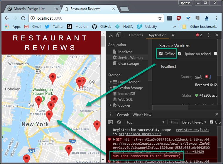 Figure 23: Cached site delivered when browser is offline
6.4 Generic offline image
In order to provide responsive image capabilities, we have 4 different sized versions of each image. These are
- *-300.jpg
- *-400.jpg
- *.600_2x.jpg
- *.800_2x.jpg
Since we can’t be sure which image the browser will request (based on viewport and pixel density requirements), we can’t guarantee the required image will have been in cached.
In order to solve for that I’ve added a standard generic image which is to be served if the site if offline and the requested image is not in the cache store.
The image looks like this.
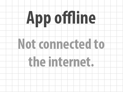
Figure 24: Offline image
The changes to the code in the ‘sw.js’ file include:
- Adding the generic image to the cache store
- Modifying the fetch handler to serve the generic image if the app is offline and the requested image doesn’t exist in cache
Here’s the code to add this is to cache.
self.addEventListener('install', event => {
  event.waitUntil(
    caches.open(staticCacheName)
      .then(cache => {
        return cache.addAll([
          '/index.html',
          '/css/styles.css',
          '/js/dbhelper.js',
          '/js/register_sw.js',
          '/js/main.js',
          '/js/restaurant_info.js',
          '/data/restaurants.json',
          '/restaurant.html?id=1',
          '/restaurant.html?id=2',
          '/restaurant.html?id=3',
          ...                         // <-- Additional cached assets
          '/img/offline_img1.png'     // <-- new
        ]).catch(error => {
          console.log('Caches open failed: ' + error);
        });
      })
  );
});
This is the code to serve the generic offline image if the app is offline and the reuqested image does not exist in cache.
self.addEventListener('fetch', event => {
  event.respondWith(
    caches.match(event.request).then(response => {
      return response || fetch(event.request);
    }).catch(error => {
      if (event.request.url.includes('.jpg')) {         // <-- new
        return caches.match('/img/offline_img1.png');   // <-- new
      }                                                 // <-- new
      return new Response('Not connected to the internet', {
        status: 404,
        statusText: "Not connected to the internet"
      });
    })
  );
});
Here’s what the site looks like when it’s taken offline and the image assets don’t exist in the cache store or the browser’s http cache.
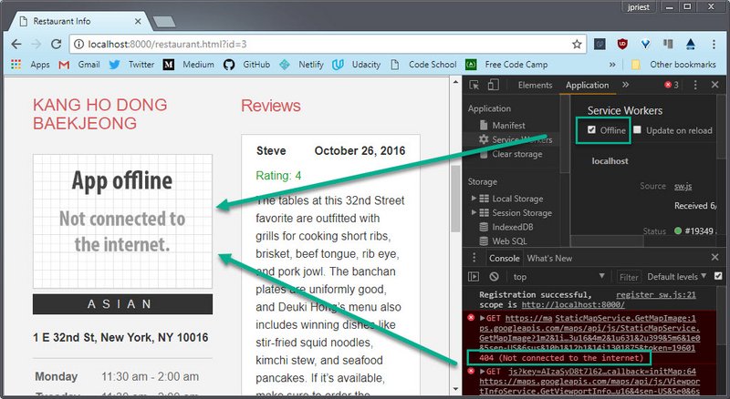 Figure 24: Chrome showing site in Offline Mode
6.5 Cache assets on fetch
In order for our app to continue to explicity build up a cache of assets we must save to the cache store on each fetch request.
Then we query the cache store on each request and serve that asset if available. If not, we do a fetch.
Note: this is necessary on top of the cache on install code because install simply does a one-time cache of assets specified explicitly in the install event.
self.addEventListener('fetch', event => {
  event.respondWith(
    caches.match(event.request).then(response => {
      return response || fetch(event.request).then(fetchResponse => { // new
        return caches.open(staticCacheName).then(cache => {           // new
          cache.put(event.request, fetchResponse.clone());            // new
          return fetchResponse;                                       // new
        });                                                           // new
      });                                                             // new
    }).catch(error => {
      if (event.request.url.includes('.jpg')) {
        return caches.match('/img/fixed/offline_img1.png');
      }
      return new Response('Not connected to the internet', {
        status: 404,
        statusText: "Not connected to the internet"
      });
    })
  );
});
If we go offline and the generic image is served, then when we go back online we need this code in order to update the cache with the requested image that is now available.
7. Final Touches
7.1 Add favicon
This was a simple addition.
I searched for a knife and fork svg image online and once I found one I it to a png with transparency.
Next I added the following line to each of the HTML pages
<!DOCTYPE html>
<html lang="en">

<head>
  <meta charset="UTF-8">
  <meta name="viewport" content="width=device-width, initial-scale=1.0">
  <link rel="icon" sizes="32x32" href="img/icon.png">  <!-- New line here -->
  <link rel="stylesheet" href="css/styles.css">
  <title>Restaurant Reviews</title>
</head>
...
The Restaurant App now has a more professional look to it by displaying an branding icon in the tab bar.
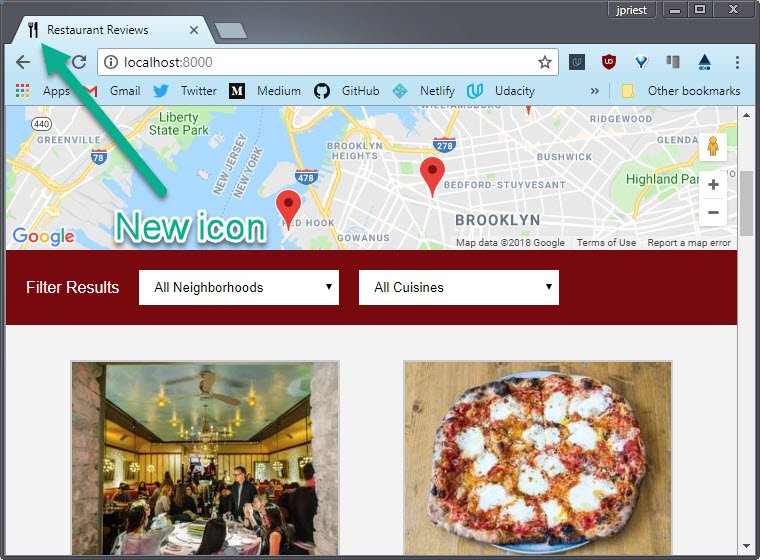 Figure 25: New app icon in tab bar
7.2 Add accessibility labels
I added labels for each of the filter combobox controls but hid them from view.
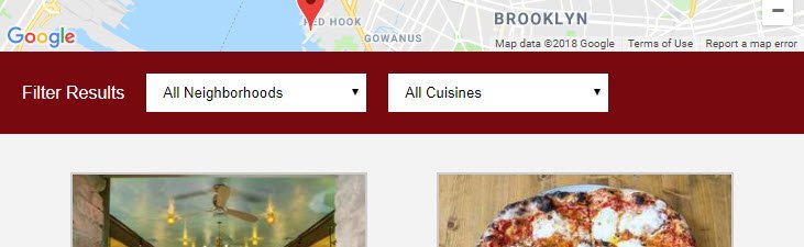 Figure 26: Filter Results section with hidden control labels
This allows a screen reader to pick up the control’s name (label) rather than just listing the control type (role), control state (state) and selectable options (values).
<div class="filter-options">
  <h2>Filter Results</h2>
  <label for="neighborhoods-select">Neighborhoods Filter</label> <!-- new -->
  <select id="neighborhoods-select" name="neighborhoods"
    onchange="updateRestaurants()">
    <option value="all">All Neighborhoods</option>
  </select>
  <label for="cuisines-select">Cuisines Filter</label>           <!-- new -->
  <select id="cuisines-select" name="cuisines"
    onchange="updateRestaurants()">
    <option value="all">All Cuisines</option>
  </select>
</div>
We want the labels to be read by the screen reader but we don’t want the labels to show on the screen.
Setting display: none or visibility: hidden also removes it from the screen reader.
Styling the labels with a zero width and hidden overflow did the trick.
.filter-options label {
  width: 0;
  overflow: hidden;
}
Now when we navigate to the Neighborhoods Filter control, the screen reader says the following:
“Neighborhoods Filter.” (Name/Label)
“All Neighborhoods.” (Value)
“Combobox, one of four” (Role/State)
When I tab to the Cuisines Filter, I hear the following:
“Cuisines Filter.” (Name/Label)
“All Cuisines.” (Value)
“Combobox, one of five” (Role/State)
7.3 Increase touch target
In order to make sure the buttons are large enough to accommodate a finger press on mobile device, the recommended minimum touch target size is 48dp.
If the image is smaller than this, the recommended approach is to add the appropriate amount of padding around the image so the touch target increases without affecting image size.
The recommended margin around a touch target is 32dp so pressing one touch target will not overlap to press another touch target.
I achieved this by increasing the padding on each of my ‘View Details’ buttons to 15px from 10px.
#restaurants-list li button {
  background-color: brown;
  color: #fff;
  padding: 15px 30px;   /* <-- here */
  text-align: center;
  text-transform: uppercase;
  margin: 0 20px;
}
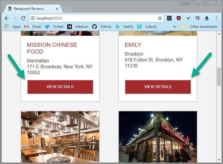 Figure 27: Increase touch target size on buttons
8. Audit Restaurant App
8.1 Run Chrome Audit
Once all my changes were completed I ran the Chrome audit. The ones I selected were
- Performance
- Accessibility
- Best Practices
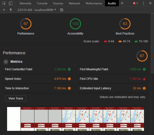 Figure 28: Chrome Audit Results
This looked good enough for my first submission!
9. Review Round 1
9.1 Review results
Here’s the results of my first review:
Hi Udacian,
Great first attempt this time :fire: Your work with this project is really appreciable and the code log you made is awesome. It totally describes that you had done your project with your full efficiency :clap: But you may forget to implement the
ARIA rolesin your code. They play a great role in your application. I had provided some links please check it down they would give you a fair idea of these tags :smiley:Excited to see your work in next submission.
Stay learning, stay udacian
The area that needed revision was Accessibility; specifically with respect to ARIA roles. The links supplied were the following:
Additional links used
- WAI-ARIA 1.1 - 5.3.4 Landmark Roles
- WAI-ARIA Authoring Practices 1.1 - Breadcrumb
- WAI-ARIA Authoring Practices 1.1 - Breadcrumb Example
9.2 Code changes
Here’s a list of additions and changes.
- Removed unnecessary comments form source code
- Added
role="banner"to<header> - Added
role="main"to<main> - Added
role="application"andaria-label="Google Map"to<section id="map-container"> - Added
role="contentinfo"to<footer> - Added
role="navigation"andaria-label="breadcrumb"to<ul id="breadcrumb"> - Added
aria-labelledby="restaurant-name"to<section id="restaurant-container"> - Added
aria-label="Reviews"to<section id="reviews-container">
9.3 Submission
Submitted updated stage 1 of Restaurant Review App.